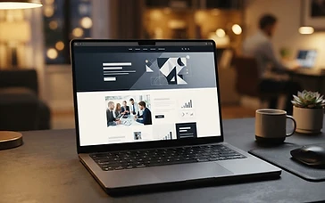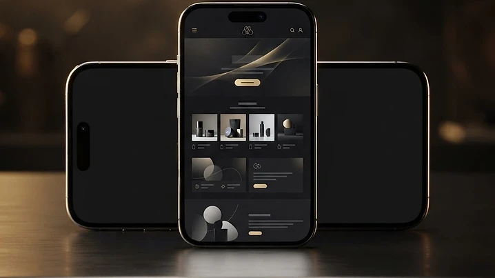
More than half of all web traffic now comes from mobile devices. If your website was designed for a desktop and then "made to fit" a phone, your visitors are probably pinching, zooming, and leaving.
Mobile-first design flips the process. Instead of designing for the big screen and shrinking down, you design for the small screen first — then expand for larger devices. The result is a website that feels natural on every screen size.
The Shift to Mobile
The way people browse the web has changed fundamentally. Phones are no longer secondary devices — for many people, they are the primary way they access the internet.
The numbers tell the story
- More than half of all web traffic comes from mobile devices
- Google uses mobile-first indexing — it ranks based on the mobile version of your site
- Mobile users are more likely to leave a site that is hard to use
- Local searches — "near me" queries — happen overwhelmingly on phones
- Mobile page speed directly affects both rankings and conversions
For local businesses — restaurants, clinics, gyms, salons — mobile is where the decisions happen. Someone searching for a service nearby is on their phone, ready to act. If your site frustrates them, they go to the next result.
What Mobile-First Actually Means
Mobile-first is a design philosophy, not just a technical checkbox. It means you start every design decision by asking: "How does this work on a phone?"
The mobile-first design process
- Start with the smallest screen — design the phone layout first
- Prioritise content — decide what matters most before adding more
- Design for touch — buttons, links, and menus that work with fingers
- Optimise for speed — mobile connections are often slower
- Then expand — add layout refinements for tablets and desktops
This approach forces you to focus on what matters. When you have limited space, you make better decisions about content, hierarchy, and user flow.
What mobile-first looks like in practice
- Touch-friendly buttons with enough space between them
- Text that is readable without zooming
- Fast loading on slower mobile connections
- Layouts that adapt cleanly to any screen size
- Forms that are easy to fill out with a thumb
- Menus that open and close with a tap
The Business Impact
A frustrating mobile experience drives visitors away. A smooth one keeps them reading, clicking, and contacting you. The difference is measurable.
What happens when your site isn't mobile-first
- Higher bounce rates — visitors leave within seconds
- Lower conversions — fewer enquiries, bookings, or sales
- Worse SEO rankings — Google penalises poor mobile experiences
- Damaged brand perception — a clunky mobile site signals an outdated business
- Lost local customers — nearby searchers move on to a competitor
What happens when it is
- Visitors stay longer — they explore instead of leaving
- More enquiries — easy contact forms and WhatsApp buttons convert
- Better rankings — Google rewards mobile-friendly sites
- Stronger brand trust — a polished mobile experience builds credibility
- More local customers — nearby searchers find and choose you
Mobile-First and SEO
Google uses mobile-first indexing. This means when Google decides where to rank your website, it looks at the mobile version first. If your mobile experience is poor, your entire site's rankings suffer — even for visitors on desktop.
This is why mobile-first design is not optional. It directly affects whether your website appears in search results at all. Read more about SEO basics and why SEO-ready websites win more customers.
Speed Is Part of Mobile-First
Mobile users are often on slower connections. A site that loads in two seconds on fibre might take ten seconds on a mobile network. Mobile-first design includes mobile-first performance.
How to keep your mobile site fast
- Compress images and serve them in modern formats like WebP
- Minimise scripts and render-blocking resources
- Use lazy loading for images below the fold
- Prioritise above-the-fold content
- Test on real mobile devices, not just browser dev tools
A fast mobile site keeps visitors engaged and signals quality to Google. Speed and mobile-first go hand in hand.
Key Takeaways
- Most web traffic is mobile — designing for desktop first is designing for the minority
- Mobile-first means starting small — design the phone experience, then expand
- Touch, readability, and speed are the priorities — not just layout
- Google ranks based on the mobile version — poor mobile means poor rankings
- Mobile experience affects conversions — frustrated visitors leave, smooth ones convert
- Speed is part of mobile-first — optimise for real mobile connections
Frequently Asked Questions
What is the difference between responsive and mobile-first?
Responsive design means a site adapts to different screen sizes. Mobile-first is a design approach where you start with the mobile layout and expand upward. All mobile-first sites are responsive, but not all responsive sites are mobile-first.
How do I know if my website is mobile-friendly?
Open it on your phone. Can you read the text without zooming? Can you tap buttons easily? Does it load quickly? If the answer to any of these is no, your site needs work. Google's Mobile-Friendly Test can also give you a technical assessment.
Does mobile-first cost more?
Not significantly. A professional web design team builds mobile-first by default — it is part of the process, not an add-on. In fact, mobile-first often costs less because it forces clearer decisions about content and layout. Explore our website design services.
Will mobile-first hurt my desktop experience?
No. Mobile-first means you design the mobile version first, then enhance it for larger screens. Desktop users get a richer, more expansive experience — not a lesser one.
Is mobile-first still important if my customers use desktops?
Yes. Even if your customers use desktops for work, they often search on mobile first. And Google ranks based on the mobile version regardless of what device your visitors use. Mobile-first protects your SEO and your conversions.
Make Your Website Work on Every Screen
If your website wasn't built mobile-first, you are losing customers every day. The good news is that a mobile-first redesign is one of the highest-impact investments you can make.
Book a free consultation and let's build a website that works beautifully on every device your customers use.